Building a Deep Learning Model for Forecasting the Cases and performing EDA
The pandemic of Severe Acute Respiratory Syndrome, Coronavirus 2 (SARS-CoV-2), is spreading all over the world and has become the most pressing issue for mankind.
The COVID-19 disease has changed the global landscape completely. A high reproduction rate and a higher chance of complications have led to border closures, empty streets, rampant stockpiling, mass self-isolation policies, and an economic recession.
The Supply Chain Management Systems that have been in practice in industries till now have not been able to meet the demand and supply surge amongst the industries across the globe.
At Clairvoyant, we have been helping clients in CPG/ retail as their traditional forecasting systems failed to respond to these drastic changes. By forecasting, one can have an idea for the demand, they can act accordingly and plan their way out. Prediction of COVID-19 spread and feeding it to forecasting of demand helped with warehouse and capacity planning efficiently.
In this article, we will take you through the process of performing Exploratory Data Analysis (EDA) on COVID-19 global data to forecast active cases, cases of recovery, and death. We have used Long Short-Term Memory (LSTM) architecture, a Deep Learning technique for building the model.
DATASET
The dataset that we have used in this project is available on Kaggle
It contains the following files:
Covid_19.csv -This CSV file contains the number of cases day-wise for every country.
time_series_covid_19_confirmed_US.csv - This CSV file contains the confirmed US cases.
time_series_covid_19_deaths_US.csv - This CSV file contains the deaths in the US.
Time_series_covid_19_deaths.csv - It contains data on the total number of deaths in the world since January 2020.
Time_series_covid_19_recovered.csv - Total number of recovered patients worldwide.
What is EDA?
EDA stands for Exploratory Data Analysis. Exploratory Data Analysis refers to the critical process of performing initial investigations on data to discover patterns, spot anomalies, test hypotheses, and check assumptions with the help of summary statistics and graphical representations.
Knowing the data well before making sense out of it is what EDA is.
Let's start with the code part!
Importing the Libraries
For performing EDA, following libraries are used:
Pandas: It is a software library written for the Python programing language for data manipulation and analysis.
Numpy: It is a library used for working with arrays. It also has functions for working in the domain of linear algebra, Fourier transform, and matrices. NumPy stands for Numerical Python.
Seaborn: Seaborn is a data visualization library based on Matplotlib.
Matplotlib: Matplotlib is a plotting library for the Python programing language and its numerical mathematics extension NumPy.
Plotly: Plotly allows us to import, copy, and paste, or stream data to be analyzed and visualized. It offers a Python sandbox (NumPy supported), Datagrid, and GUI for analysis and styling graphs. It is a scientific graphing library.
Using the head() function, we can see the first few rows of the data, and by giving the tail() function, we can see the last few rows.
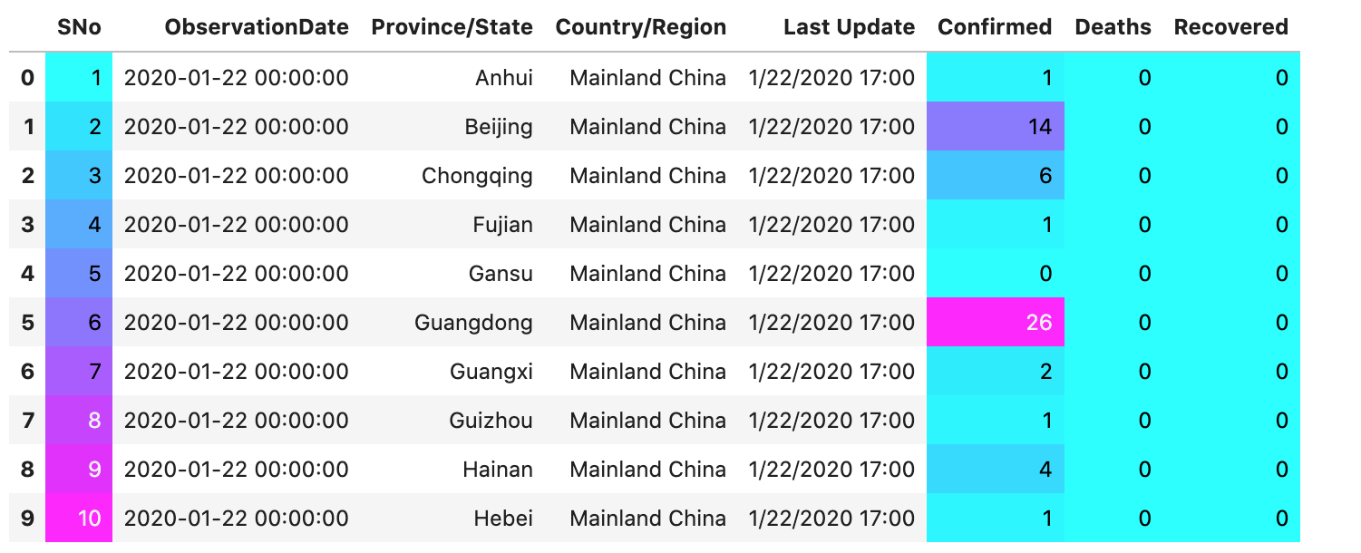
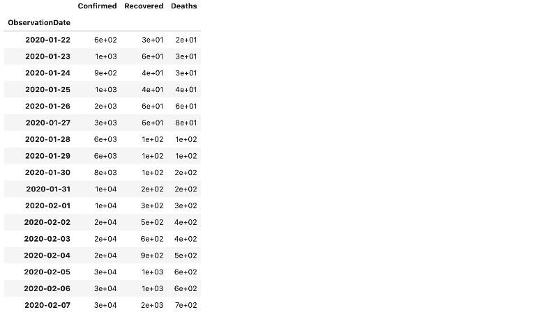
This shows the confirmed cases date-wise at the start of 2020.
This indicates that the number of confirmed cases for a day was significantly less for every country.
For Beijing, the cases confirmed were 14.
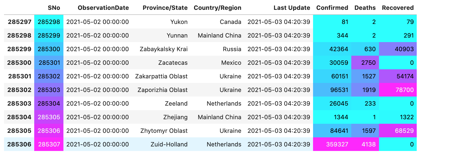
This shows the confirmed cases date-wise.
This indicates that the confirmed cases for a day varied for every country. For Canada, the cases confirmed were 81, while at the same time in Russia, the confirmed cases were around 42,364.
We used the describe() function to know the statistical summary of the DataFrame columns.
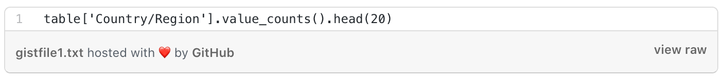
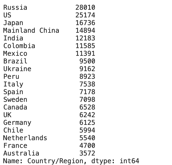
value_counts() function returns an object containing counts of unique values. The resulting object is in descending order so that the first element is the most frequently occurring element. It excludes NA values by default.
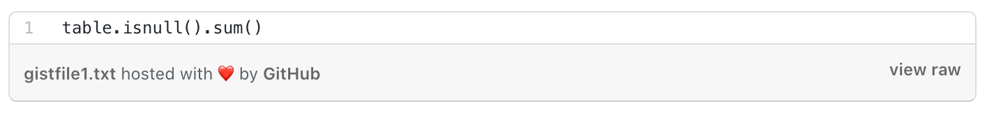
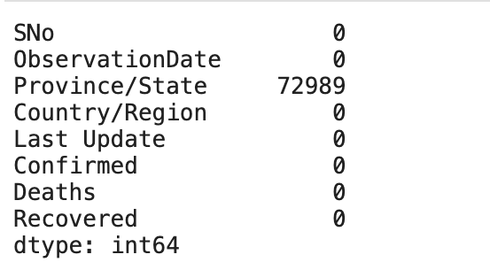
isnull() function detects missing values in the given series object. It returns a boolean same-sized object indicating if the values are NA. Missing values get mapped to True and non-missing values get mapped to False.
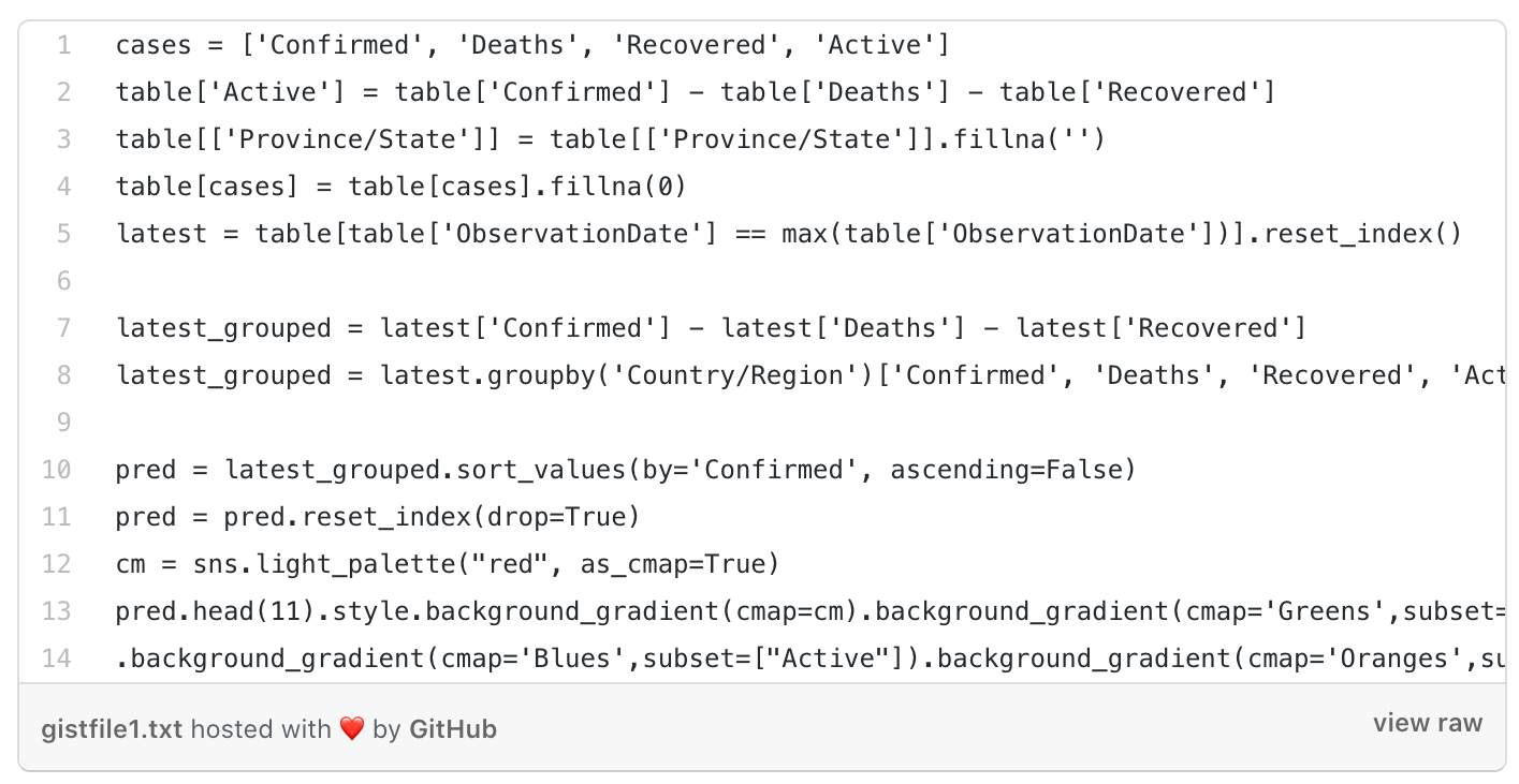
For visualizing the data we used different types of graphs like bar graphs, Histograms, boxplots, and some others.
Plotting the active cases, confirmed cases, deaths, and recovered cases in the world, and displaying the top 10 countries that were affected the most
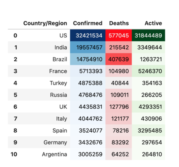
The above output shows the confirmed deaths and active cases for every country. Here, we can observe that the most effective country was the US. It had around 577,045 deaths, which was the maximum.
Now, displaying cases date-wise:
Displaying top 10 dates when the confirmed case counts were highest
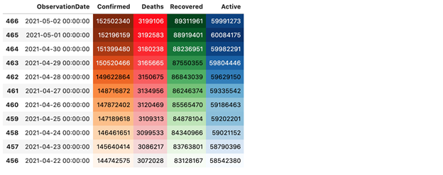
The above table displays the confirmed cases date-wise when there were maximum cases reported.
On 02-05-2021 there were maximum cases reported.
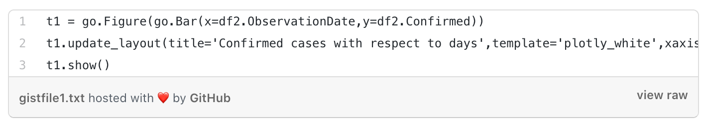
Plotting Bar Plot for the total number of Confirmed vs Recovered Vs Active and Deaths
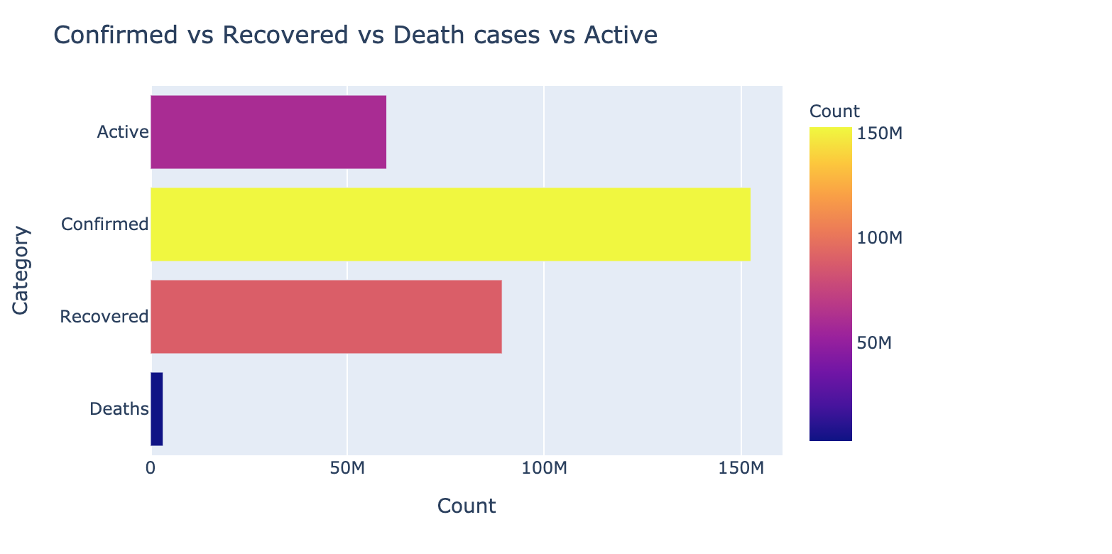 This graph shows the number of active cases, confirmed cases, recovered cases, and deaths through plotting bars. It shows that the recovery numbers were far behind the confirmed numbers, which was a concern.
Plotting top 10 Countries with the most number of Confirmed cases
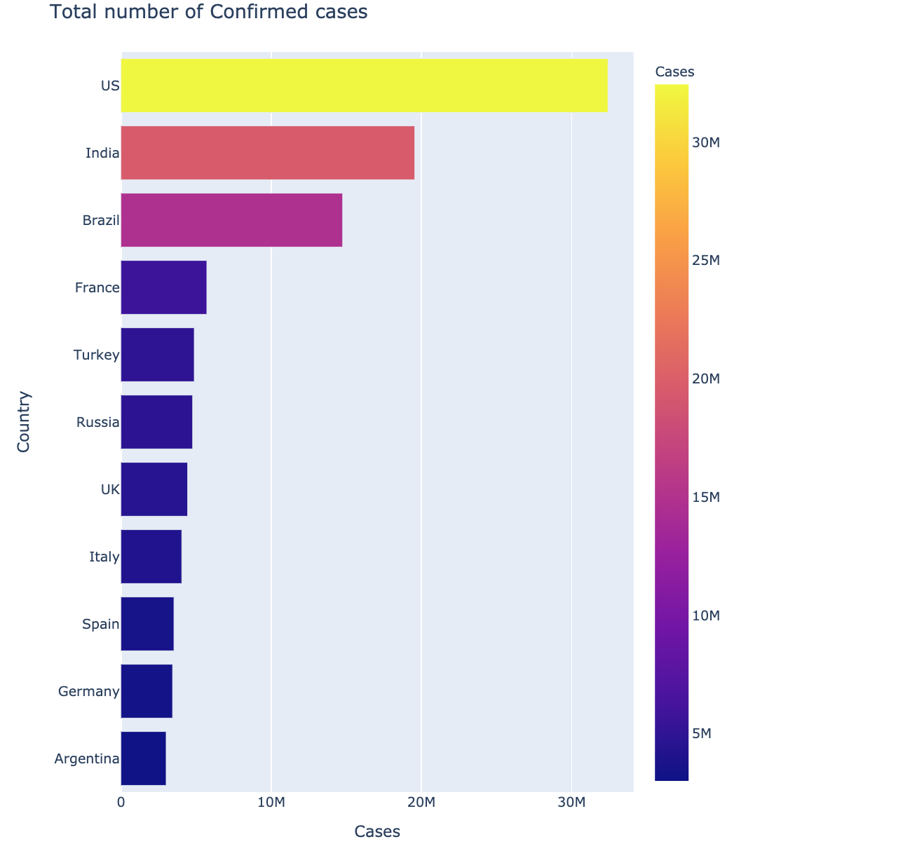
The above graph shows the number of 10 most affected cases country-wise. The United States was the most affected country, with 32,421,534 cases reported till date.
Plotting Top 10 countries with most Deaths
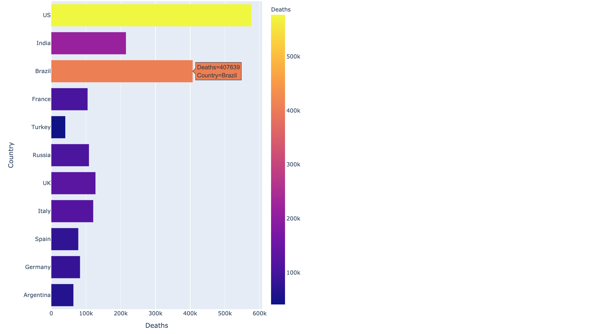
The most deaths graph plots the total number of deaths for every country and shows the top 10 countries in which the deaths were maximum. The US was on the top with a maximum number of deaths, followed by Brazil with 407,639 deaths.
Top 10 countries with the most number of Active Cases
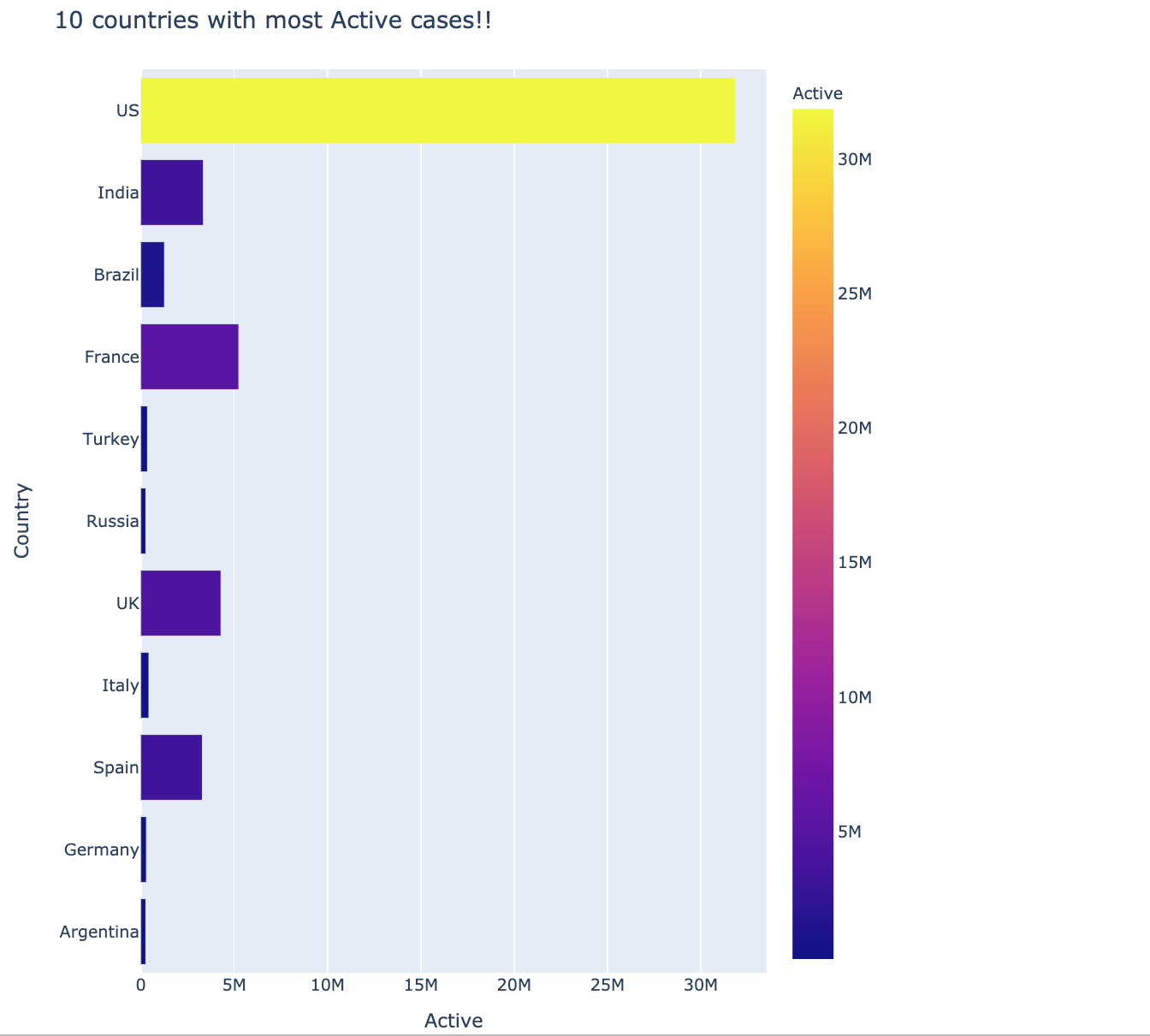
The most active cases graph plots the total number of active cases for every country. Most active cases were in the US. The dataset used is a bit old so the numbers might have changed by now.
Rate of Increase in Infection with respect to Time
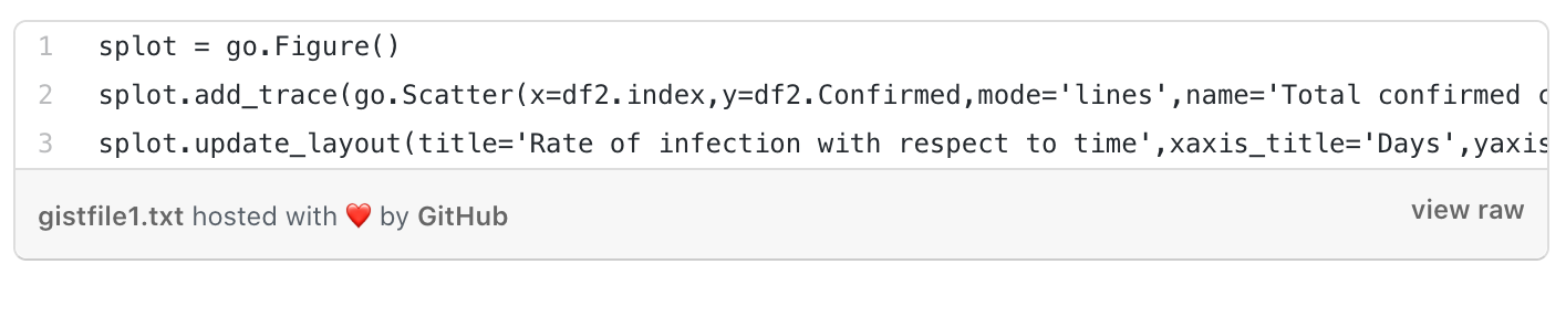
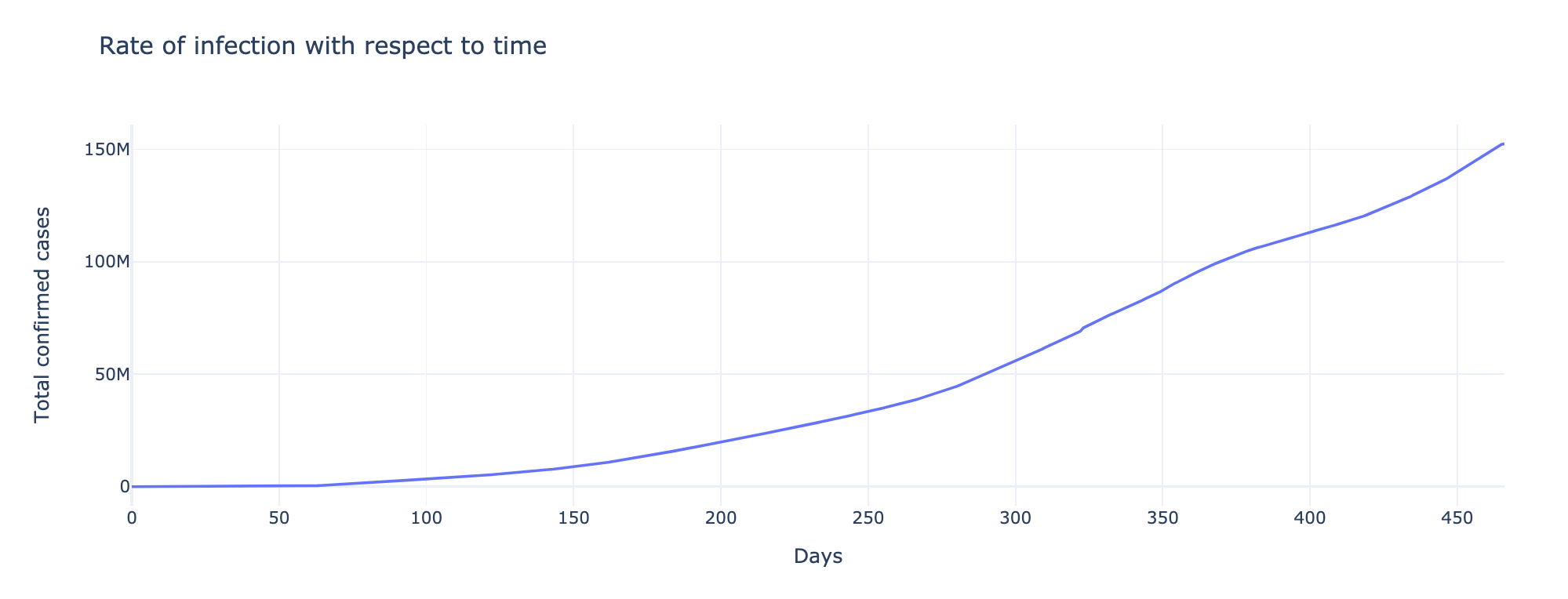
The above graph shows how the rate of infection had increased. In the beginning, between 0-100 days, the infection rate was low. It can be seen that the cases had increased rapidly after 400 days and the count had increased further.
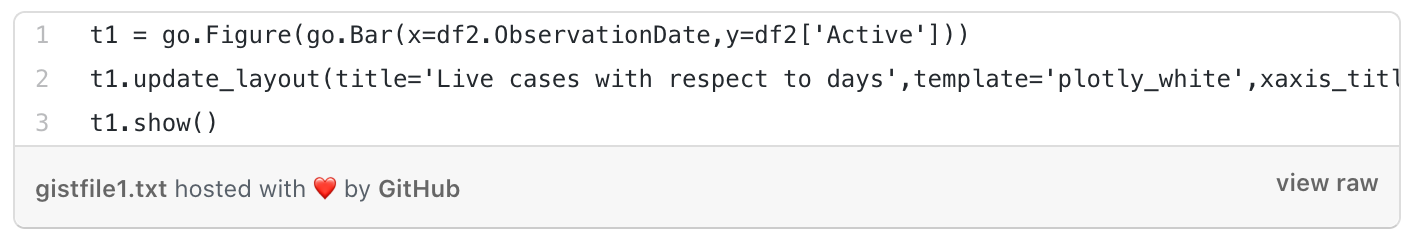
Plotting Active case rate with respect to Time

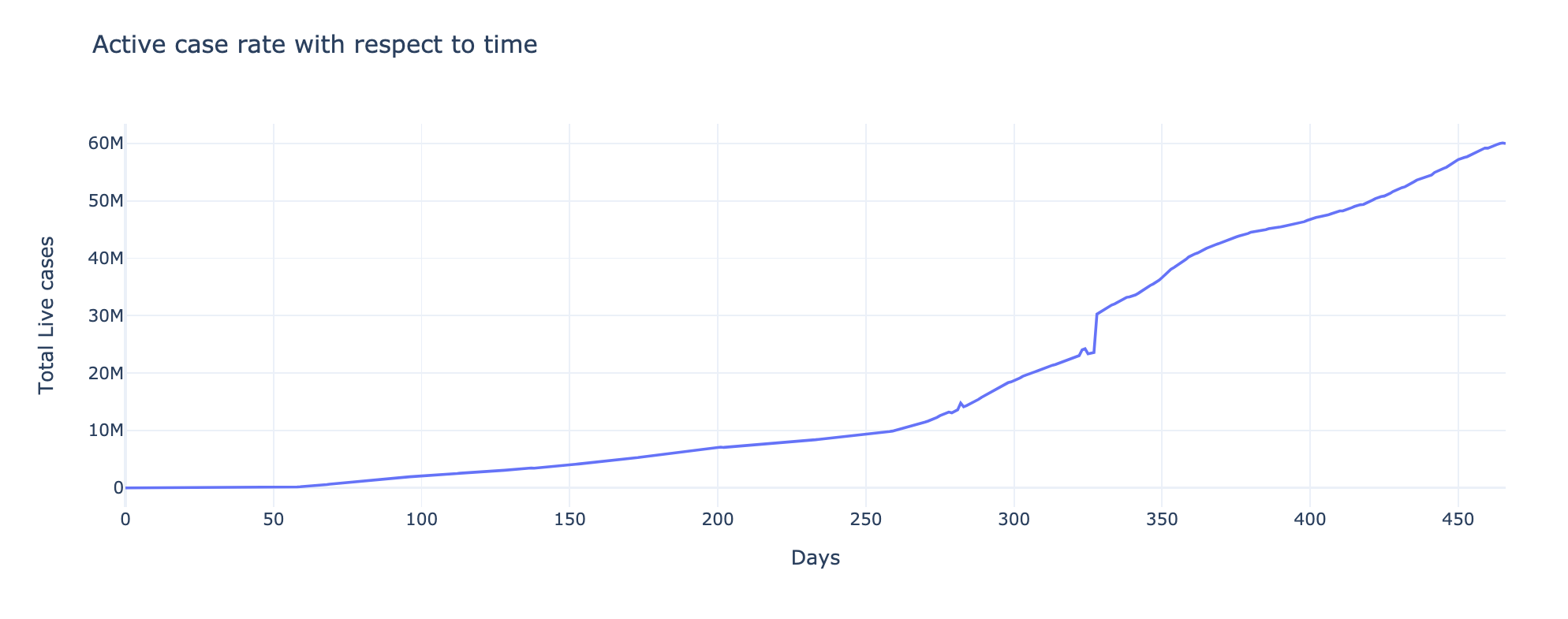
Here, we have plotted the active cases with respect to time. The X-axis plots the count and the Y-axis shows total live cases. The peak had reached 60M in 450 days.
Death toll with respect to Time
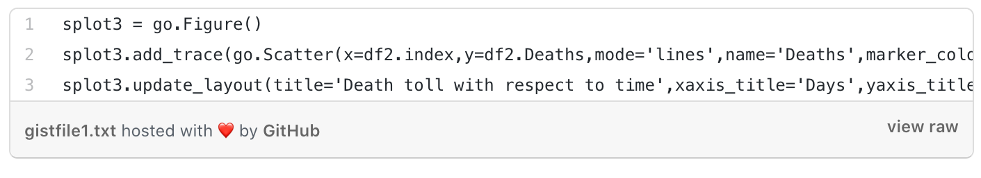
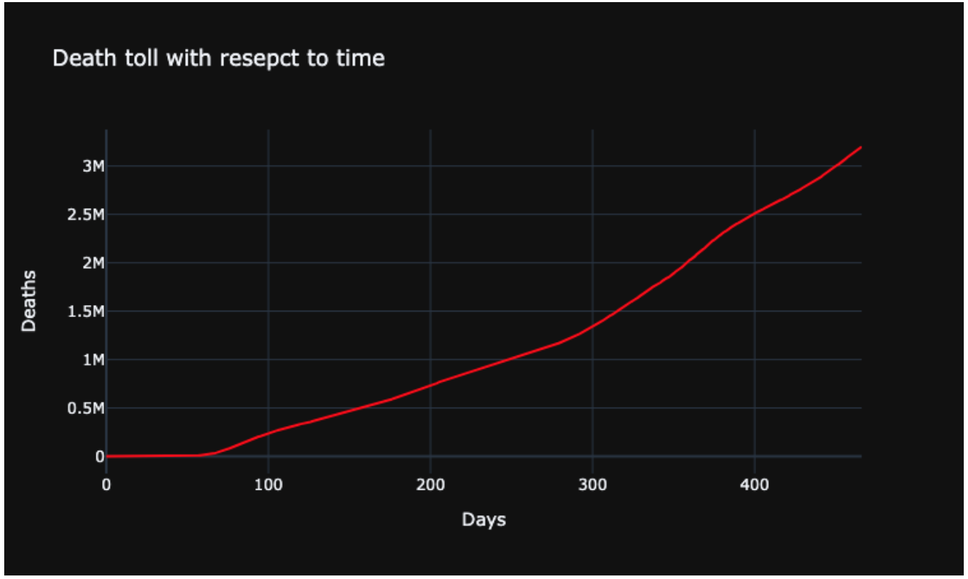
Similar to the above two plots, here we have plotted the death cases. We can see that the death cases kept on increasing exponentially. After around 90 days, the rate of deaths increased as the days passed. The peak deaths had been 3 million worldwide.
Plotting Confirmed based on Days (Months)
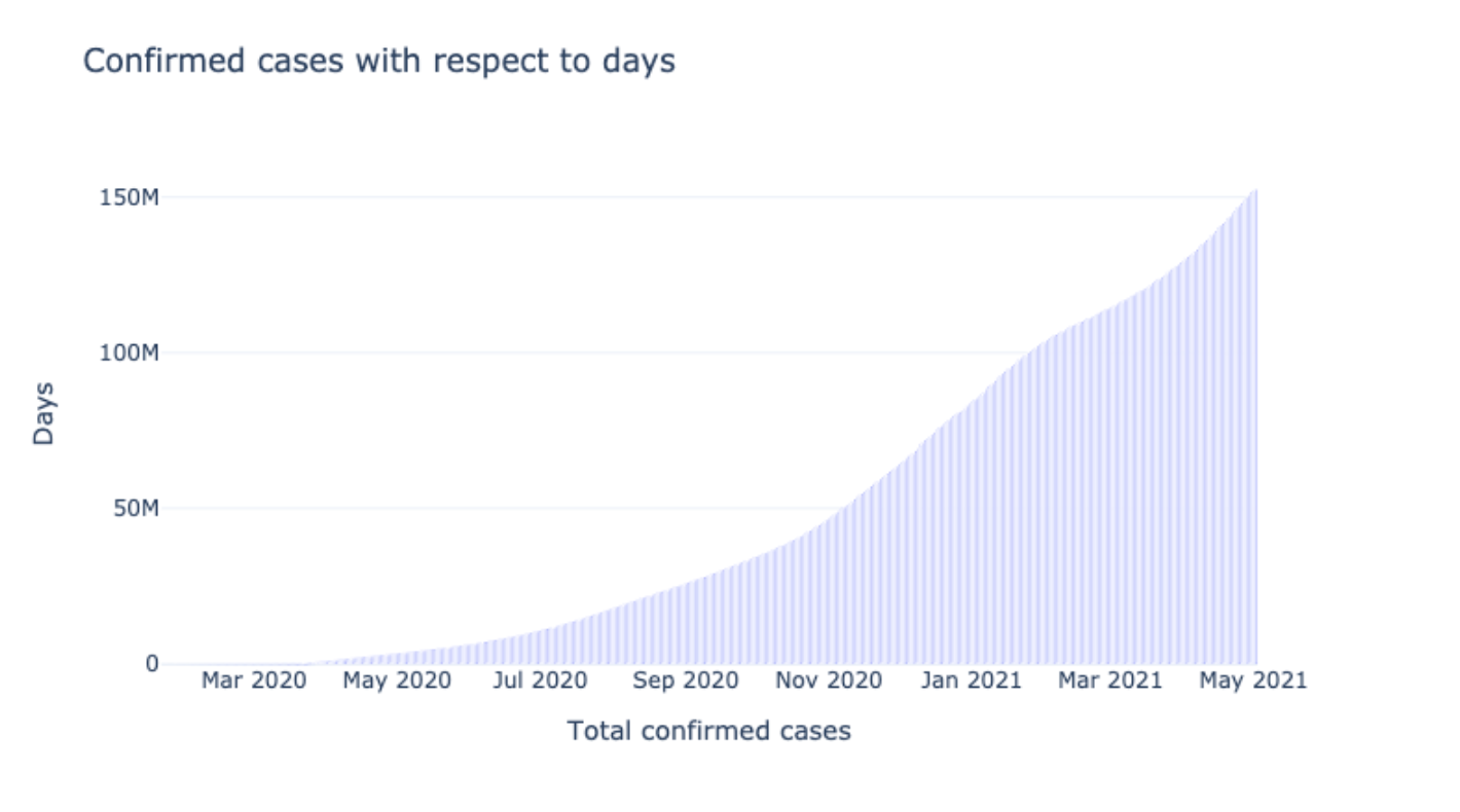
This plot shows the confirmed cases according to the months. It gives a broader view that can help visualize the data of how the instances increased and when they were maximum.
Active cases based on Days
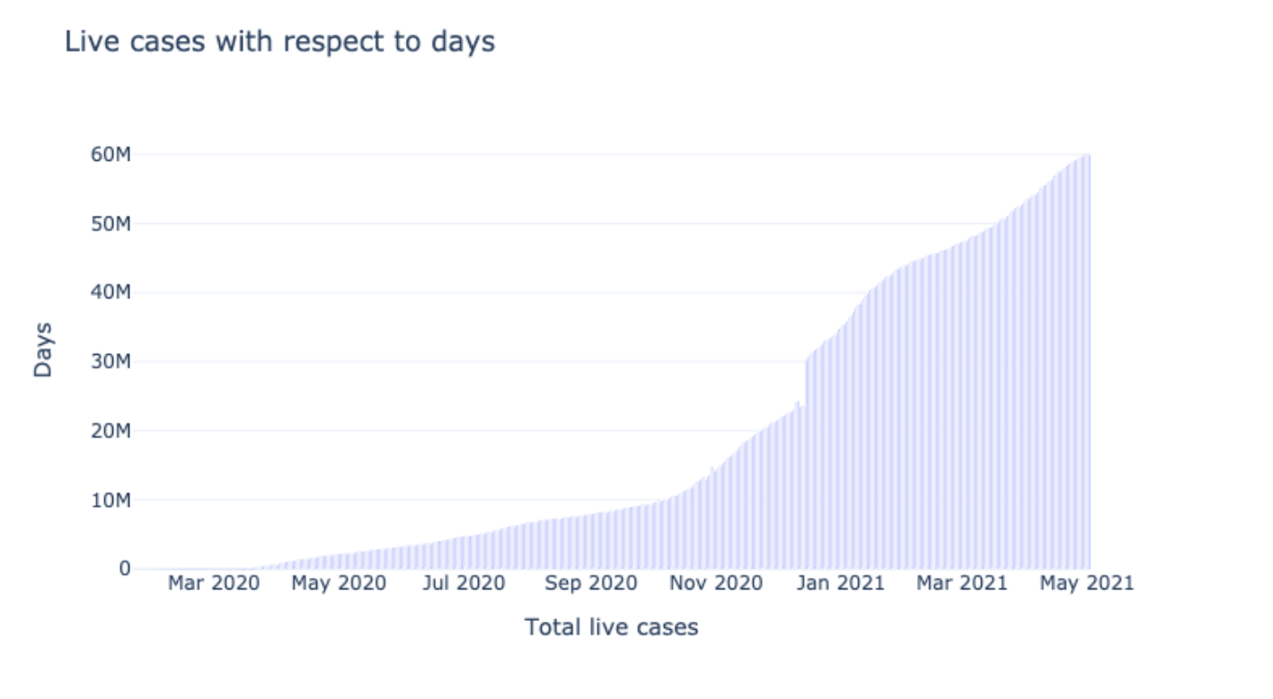
This graph plots the active live cases pertaining to days. The live cases were maximum in the month of May 2021. Through these graphs, we get a wider image of the issues month-wise.
Death toll based on Days
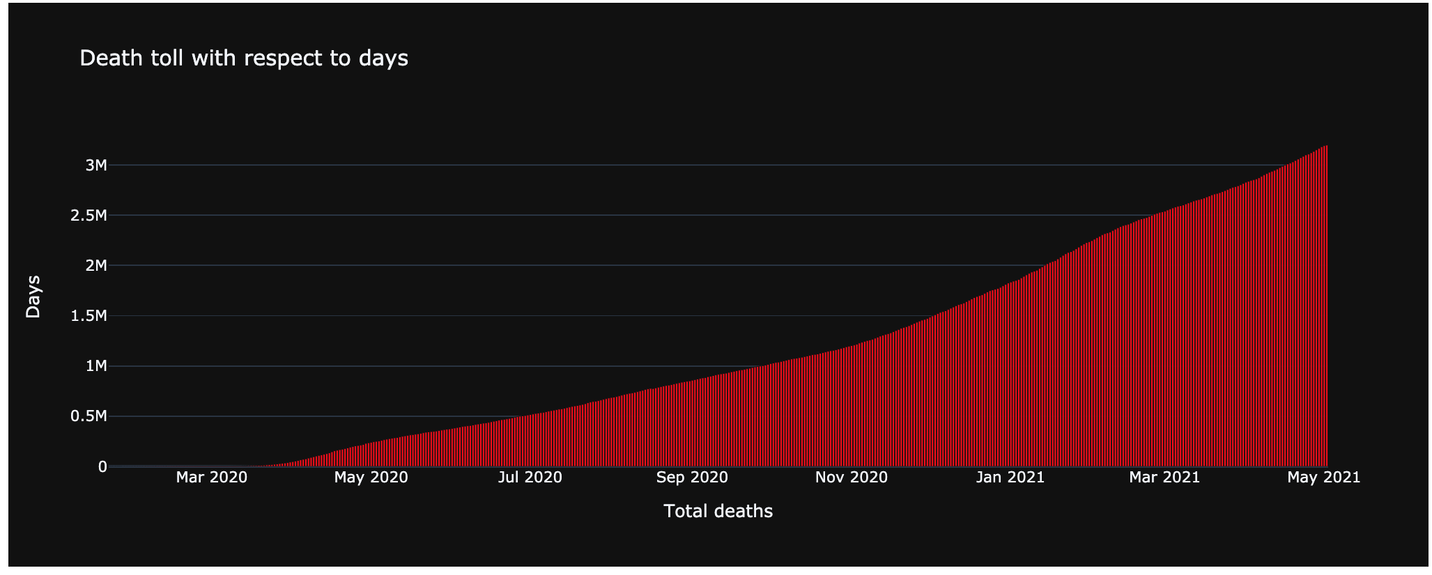
This graph plots the deaths with respect to days. Here we can see that the deaths in March 2020 were zero. After that, there was an increase in the number of cases every month.
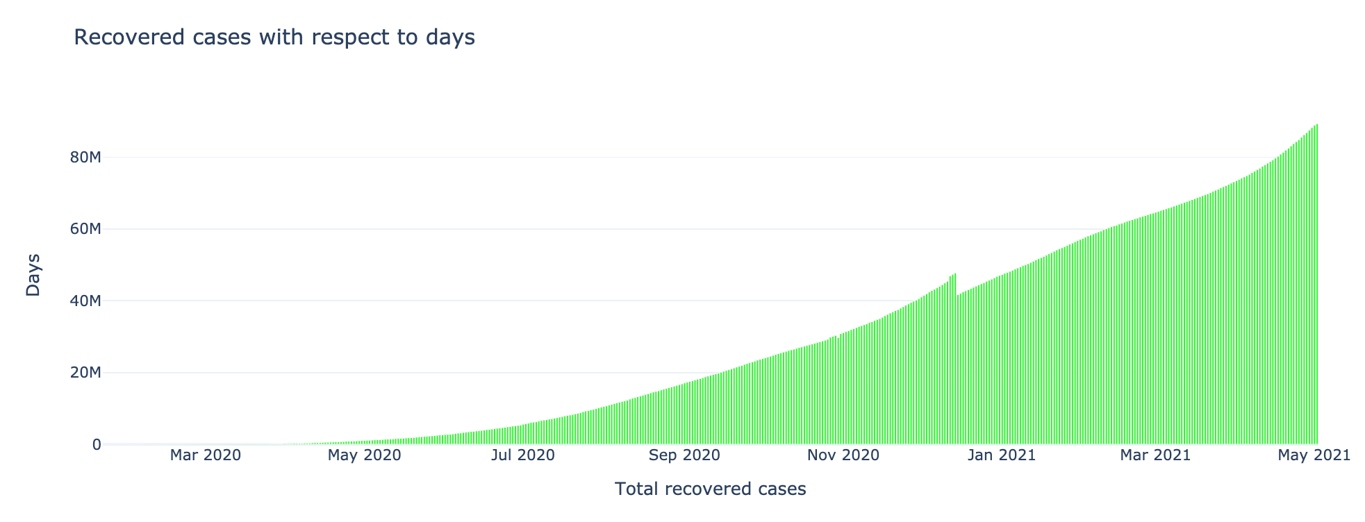
Recovered cases with respect to Days
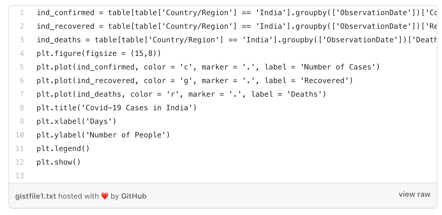
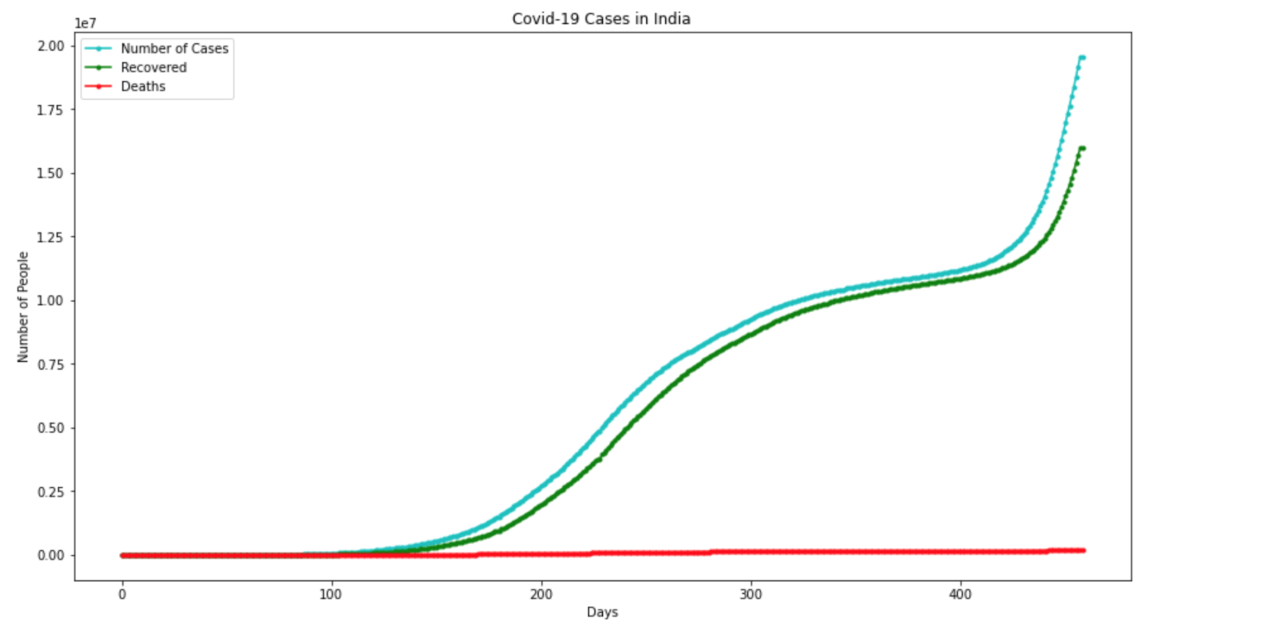
COVID-19 Analysis In India
Forecasting Using LSTM
For predicting the COVID-19 numbers for our model, we built our model with the help of LSTM architecture.
After this, we plotted a graph between the actual COVID-19 numbers and the predicted numbers from the model.
We went with RNN for Time Series prediction instead of other models because LSTMs are better at identifying complex pattern logics from data by remembering what's useful and discarding what's not.
Steps performed to forecast, using the model:
DATA PREPARATION
Checking the shape:
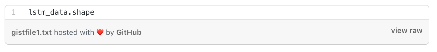
(467, 3)
It has 467 rows and 3 columns.
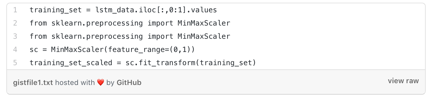
PRE-PROCESSING DATA
Since the number of COVID-19 cases got rather large over time, our model's calculations during training might have been prolonged. This was fixed by using sklearn's MinMaxScaler to rescale our data.
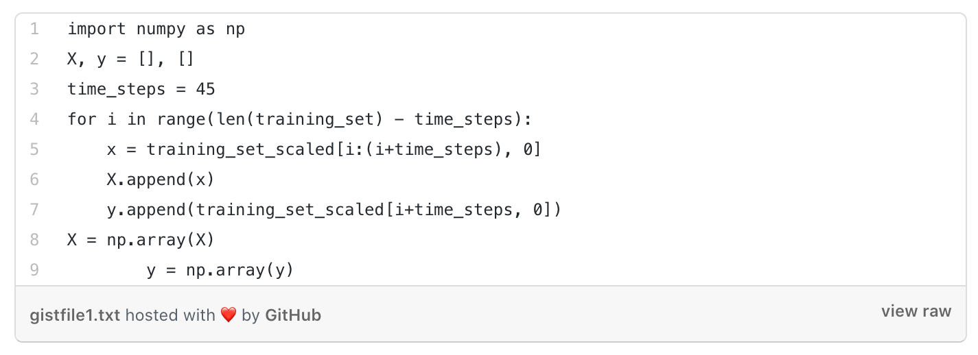
We split the X and Y in such a way that X contained cases for a certain amount of previous days (time_step) and Y contained the reading for the next day.
This way, the model was trained to predict the number of cases on a certain day based on the trend in the number of cases within the previous time_steps number of days.
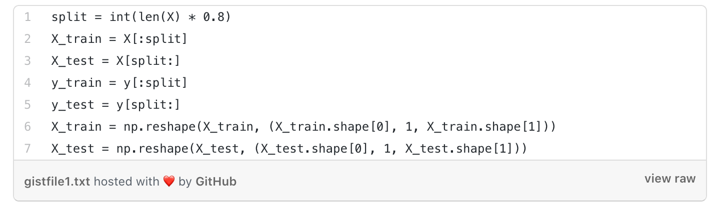
DATA PARTITIONING
Since we looked at a chronological timeline of COVID-19 cases, we took the first 80% of the data as our training, and our testing was on the remaining 20%.
We reshaped the input X[n] partitions so our model could process them properly.
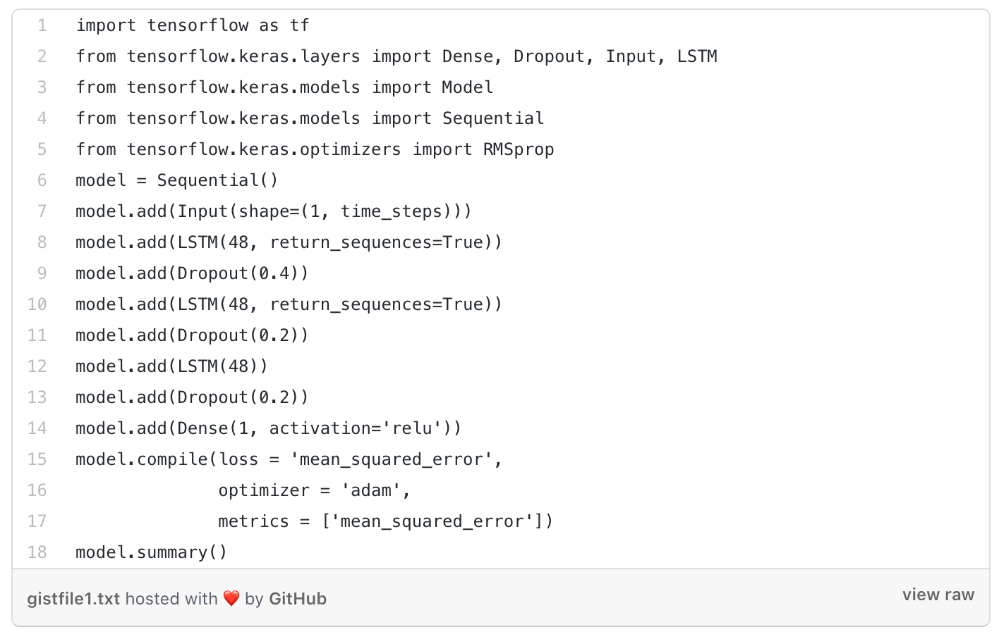
BUILDING MODEL ARCHITECTURE
We built the model with the help of LSTM.
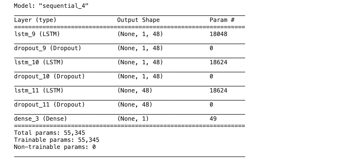
The model has an input layer followed by three LSTM layers.
The LSTM layers contain Dropout as 0.5 to prevent overfitting in the model.
The output layer consists of a Dense layer with 1 neuron with activation as ReLU.
We predicted the number of Corona cases, so our output was a positive number (0, ∞).
We took the loss as 'mean_squared_error' and the optimizer taken was adam optimizer for compiling the model.
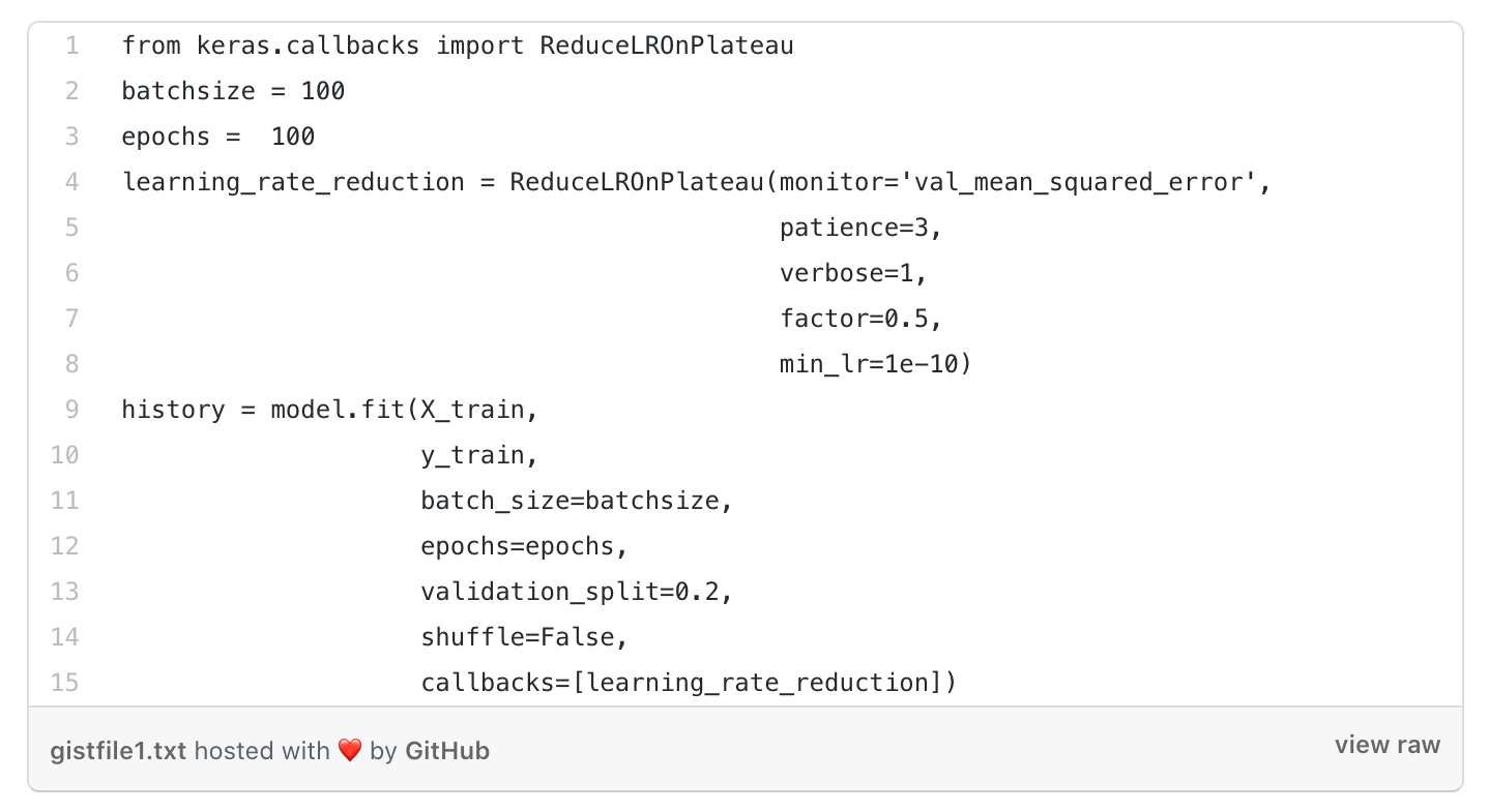
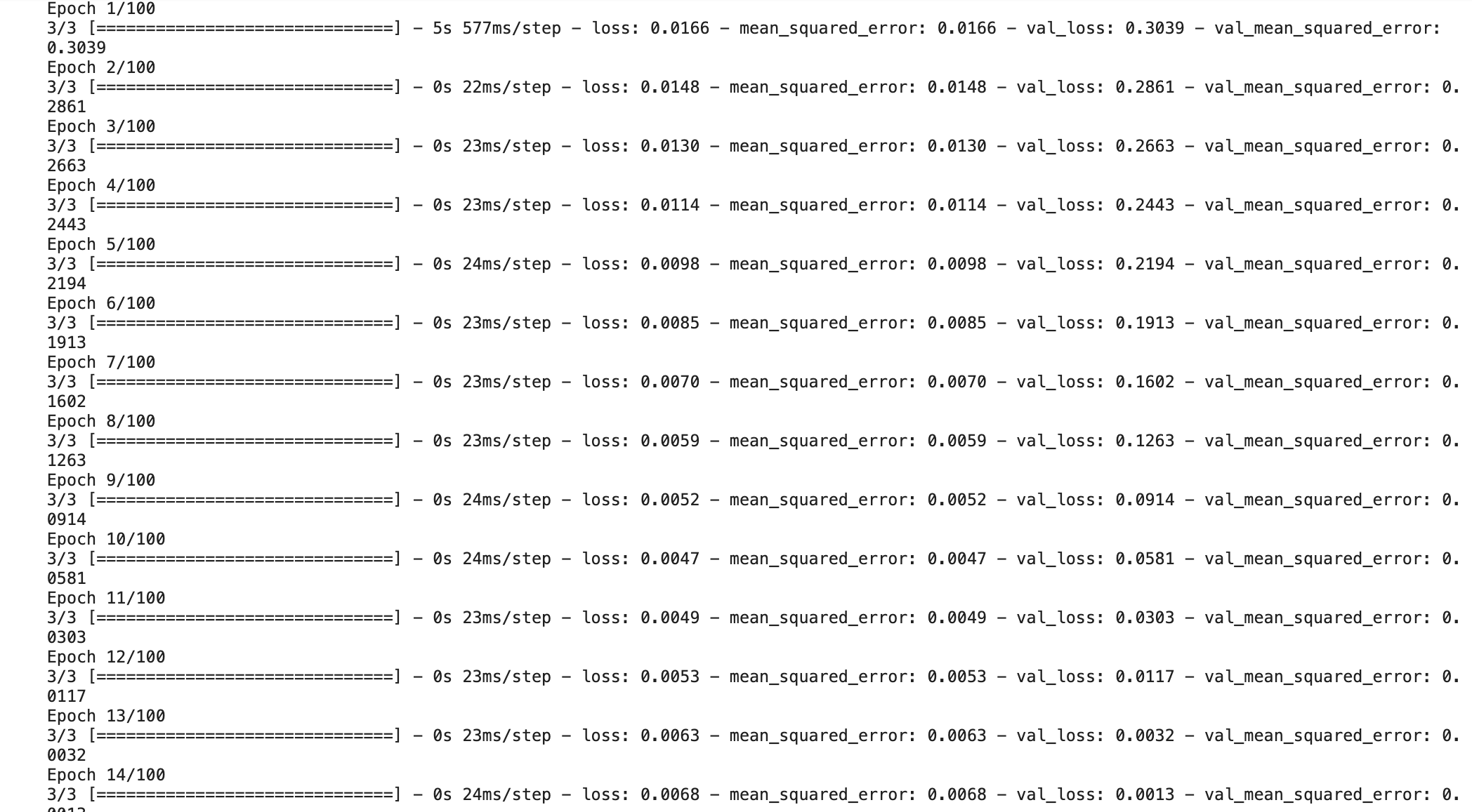
TRAINING THE MODEL
To train the model, we took out training data (80%) and used 20% of it as validation data.
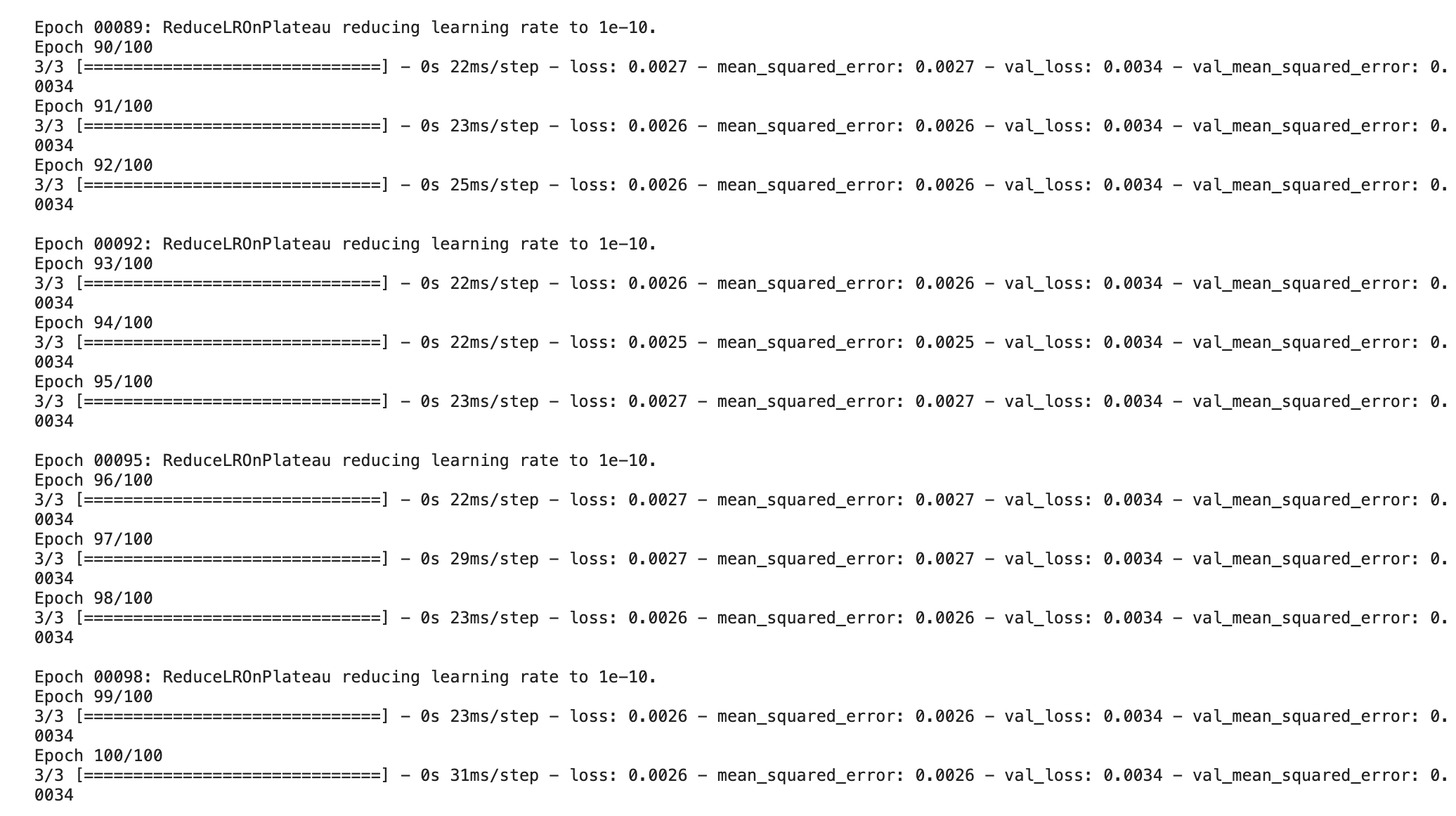
To lower the learning rate of our model we used ReduceLROnPlateau in the model.
Training the model with 100 epochs
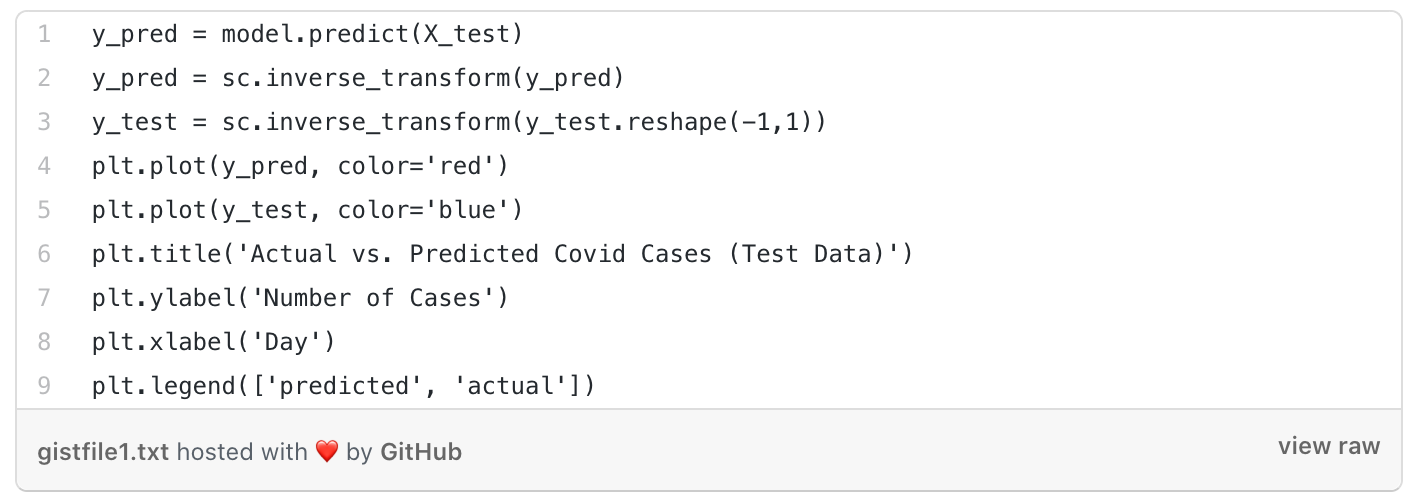
PLOTTING THE PREDICTION
In order to see the prediction and accuracy, first, we predicted the output of our X_test data. This was the output that we got from the test data.
To accurately plot the values, we needed to bring our prediction and y_test data back to the original bounds of the data.
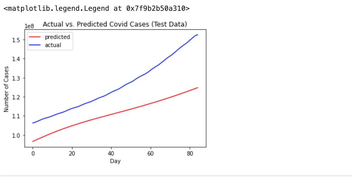
In the end, we plotted a graph between the actual COVID-19 cases compared to our predicted COVID-19 cases to see the overall accuracy of our model.
CONCLUSION
By performing EDA, we got to know the dataset better and we could bring out meaningful information from the dataset to figure out if any flaws existed in the dataset.
There are many algorithms available for forecasting the data and many statistical models like Random Effect, Fixed Effect, etc., but all these models are linear. Therefore, it can be difficult to adapt to multiple input forecasting problems.
The LSTM model, which is being used for forecasting, has an exponential trend in the number of COVID-19 cases, which is quite similar to the real number of cases. This model can give better results if it is trained with more epochs.
Hope you found this post interesting and informative! Don’t forget to check out our artificial intelligence services for all your business needs.
REFERENCES
https://www.kaggle.com/adimanz/covid-19-data-analysis-forecasting-using-rnn/execution
https://medium.com/analytics-vidhya/exploratory-data-analysis-on-covid-19-tweets-721f94bae087
https://www.kaggle.com/canyilmazz/covid-19-eda-plotly-visualization/notebook